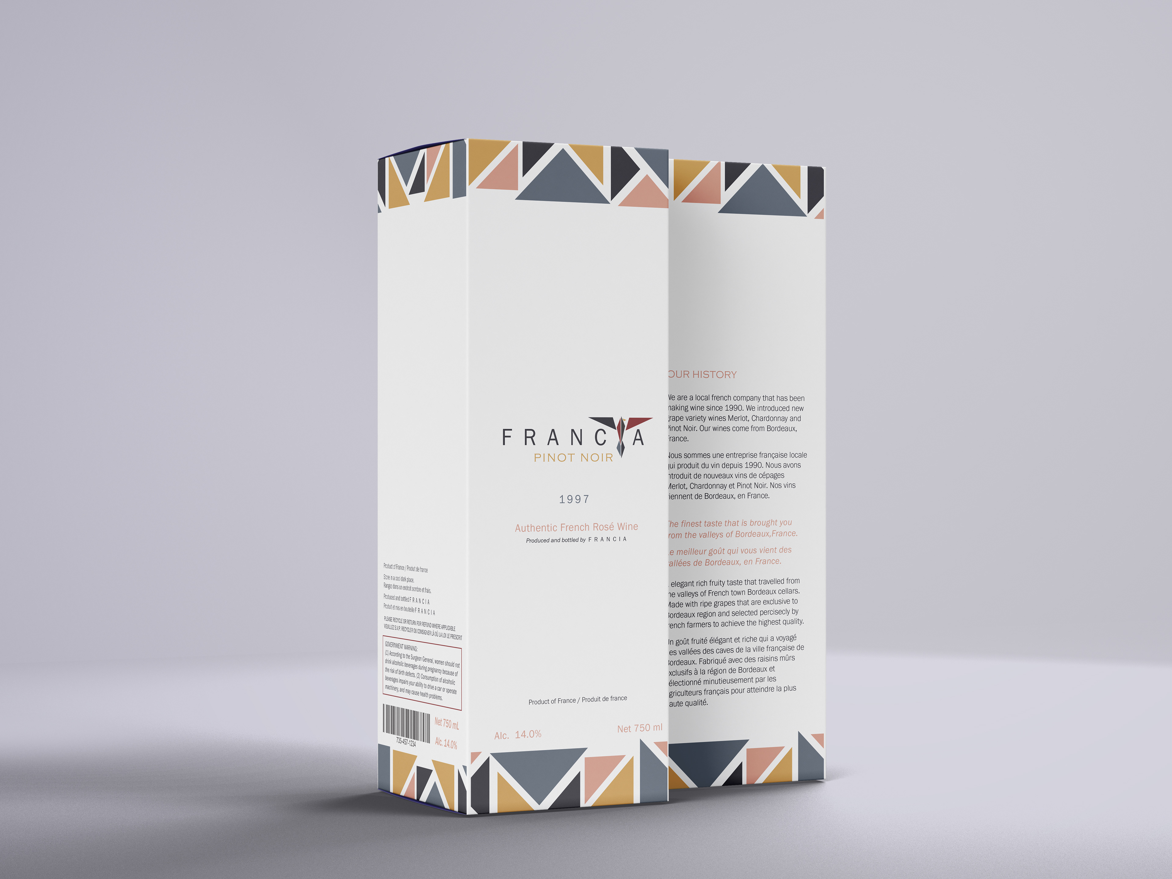
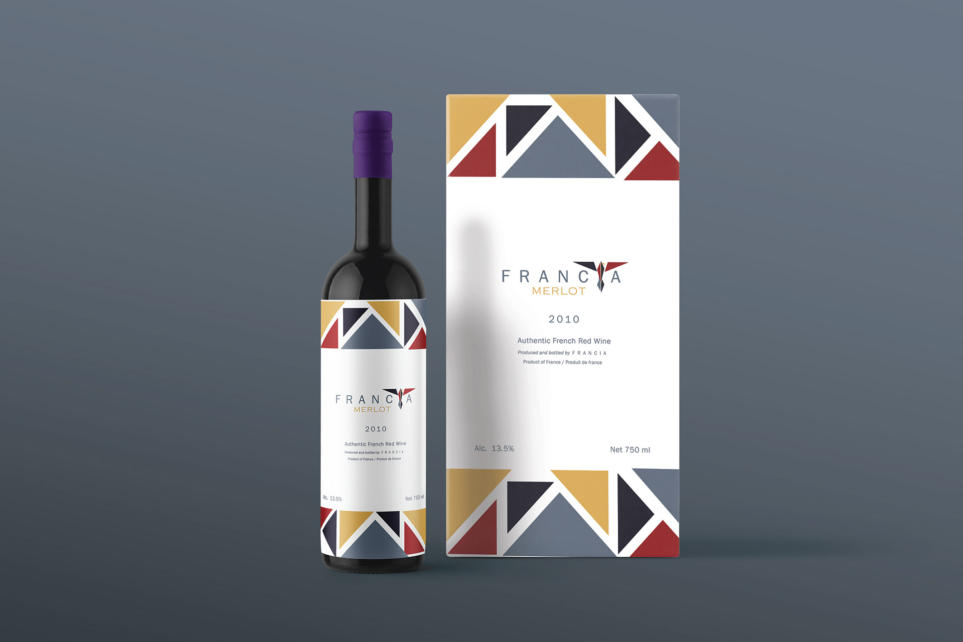
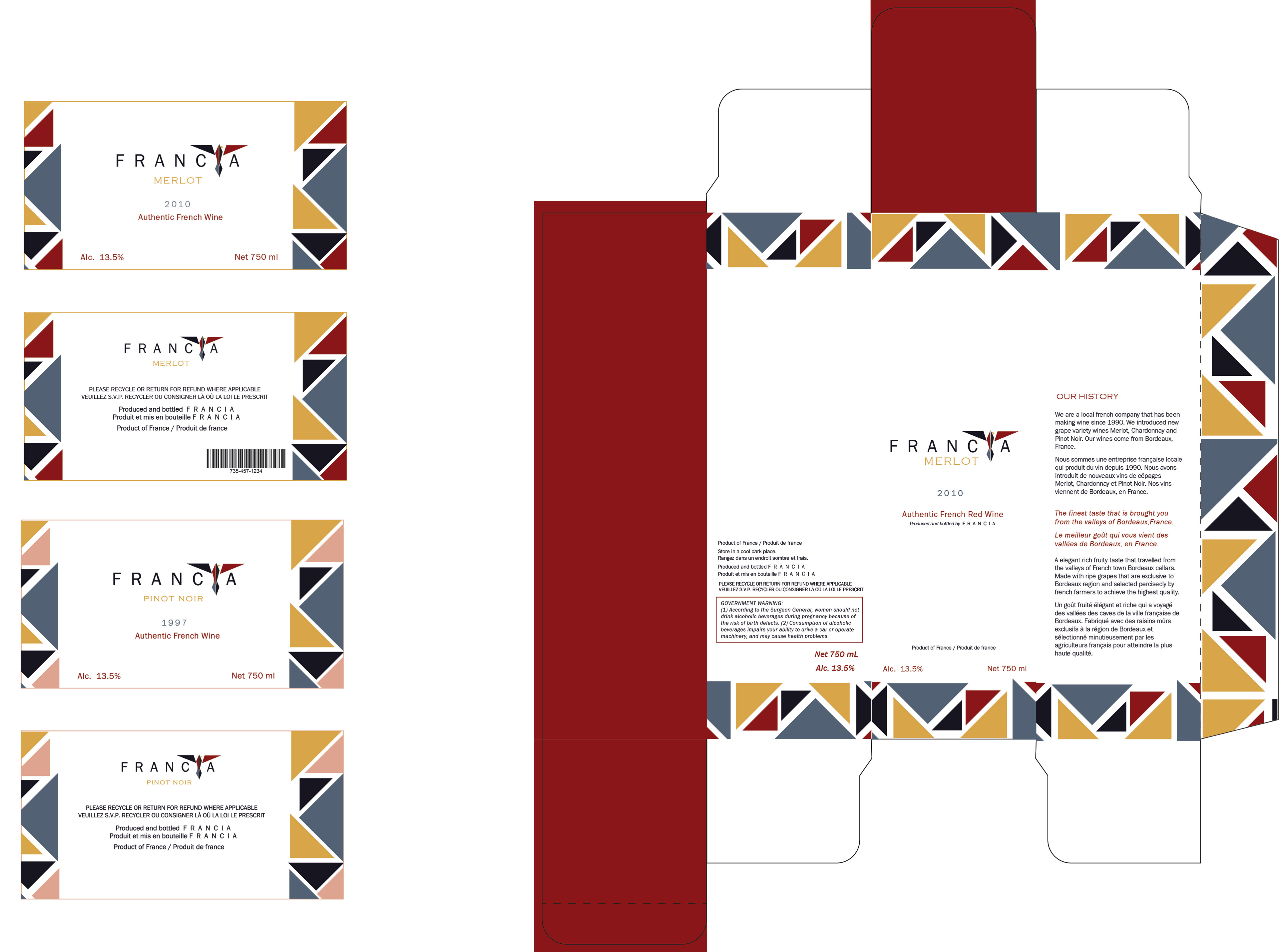
A modern style brand identity, package and label for a French wine company FRANCIA. The name of the brand simply comes from the word for “ Kingdom of the Franks”
Usually there is a generic type of design that is made for wine packaging but graphic designers started to come up with more contemporary style designs. Geometrical shapes rather than organic shapes to add more modern style to design. The color scheme inspirited by variety of grapes. The colors such as burgundy ,Prussian blue and Aegean blue with a mustard color. Mustard color is not typically associated with grapes however there is a type of grapes that turn into this beautiful yellow-mustard color when its dried. I though it worked with the balance of the other colors as well. The colors and triangular shapes work like a mozaique pieces this design.
Brand sells Merlot wine. Brand's identity takes its form from the fact that Merlot represents a blackbird.
All packages have a very simple detail that makes it easy to differentiate from the other types of wine. The wine types are assigned to a one specific color that is on the very back of the design. Every type of wine has a different color on the back makes it easier to choose with only one glance.


